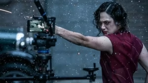
Today I will focus on colour grading a film, one of the very important post production jobs. It is essential that you have locked off picture edit, before you start the colour grading process.
Colouring and grading a film is an essential part of post-production that enhances the visual storytelling by manipulating the colour palette, contrast, and brightness to create mood, tone, and consistency. As a Film Director, you want your film to have a certain look at certain points in the story and this is the time to really go for it.
With most of the good cameras shooting raw footage, you have a vast range to determine the look of the film. Also, what colour grading accomplishes is the images look sharp and pop.
Here’s a guide on how to approach the process:
- Understanding the Basics:
Colour Correction: This is the first step where you adjust the footage to ensure natural and accurate colours. This involves:
- Balancing the exposure (making sure shots aren’t too dark or too bright).
- Fixing white balance (correcting color temperature).
- Matching shots from different cameras or lighting conditions so that they feel cohesive.
Colour Grading: After correcting the footage, you can apply a creative grade that enhances the mood, style, and atmosphere of the film. Grading gives you creative freedom to push certain tones or desaturate or saturate colours to fit your narrative.
- Tools for Colouring and Grading:
Popular software for colourr correction and grading includes:
- DaVinci Resolve (most powerful and industry-standard tool, free version available).
This is the software, I love and use. It is the best and this is the one I advise you to use. - Adobe Premiere Pro (Lumetri Color panel). It is good but nowhere near the power of DaVinci
- Final Cut Pro. Ok
- Avid Media Composer (for high-end professional work). Good
- DaVinci Resolve (most powerful and industry-standard tool, free version available).
- Color Correction Workflow:


Step 1: Monitor Calibration
Ensure you’re using a calibrated monitor to ensure the colours you’re working with are accurate. Calibration prevents unintentional colour shifts when viewed on different devices.
Step 2: White Balance
Correct the white balance to remove any colour casts caused by lighting (too warm or too cool). This brings out the true colours of the scene.
- Use the eyedropper tool on a neutral white or grey area.
- Adjust the temperature and tint sliders until whites and skin tones look natural.
Step 3: Exposure Adjustment
Fix any underexposed or overexposed shots:
- Adjust lift, gamma, and gain (or shadows, midtones, highlights) to balance the brightness across the image.
- Use the waveform monitor to ensure your image isn’t clipping (over-bright or over-dark).
- Most important is your eye. With a good monitor, you can see how the film will look and adjust accordingly.
Step 4: Contrast and Saturation
- Add contrast to make the image pop. This brings out the blacks and the image
- Adjust the saturation to make colours more vibrant, but avoid overdoing it, unless there is an artitistic reason to do so.
- Colour Grading Styles :
Identify the emotional tone you want to convey. Different colour palettes evoke different feelings:
- Warm tones (orange, yellow, red) create a cozy, inviting, or intense atmosphere.
- Cool tones (blue, green) convey calm, sadness, or tension.
- Desaturated tones (muted colours) can give a serious, dramatic, or gritty feel.
- Saturated colour can create an optimistic feeling but needs to be used subtle. Many comedies such as Rom Coms work this area.
Step 3: Should you use LUTs (Look-Up Tables) ?
LUTs are pre-made colour grading filters that instantly apply a look to your footage. You can either:
I personally do not like them as they are for lazy colour grading. Each shot and scene needs personal attention and personally I avoid LUTs
- Final Output:
- Check across devices: Test how your film looks on different screens (TVs, smartphones, monitors) to ensure consistency.
- Some beginner graders use references: Have reference images or films with a look you’re aiming for. This helps guide your decisions. I like this because if you get the same look as a famous film that matches your genre, you will have a good colour grad
Colour grading can transform the mood and impact of your film, helping tell your story in a visually compelling way. It is a very creative process and you will gain your own style. Make sure you watch a final version of the outputted film and that it stands the Hollywood Movie test. Does your film look amazing and reflect the mood of your film?
Practice makes perfect. If you can grade your own films you will save considerable cash budge. Also, colour grading is a very enjoyable process. Take your time and complete the job diligently.